Crafting Trust Through UX: Designing the Luxury Collectible Assets Management Application
As the sole Product Owner and Product Designer for Vault, I led the end-to-end design process for a mobile-first app targeting ultra-high-net-worth (UHNW) individuals managing high-value collectibles like fine art, watches, jewelry, rare wines, and classic cars. My responsibilities included user research, persona creation, journey mapping, wireframing, high-fidelity prototyping, UI design, microcopy, and establishing the brand's visual identity and voice. Collaborating closely with a cross-functional team (including developers, a product manager, and stakeholders from wealth management firms), we aimed to create a discreet, secure platform that prioritizes privacy and elegance. This project spanned 6 months, from initial discovery to MVP beta launch, and emphasized iterative design to align with user needs and business goals.

Challenge
UHNW collectors face a fragmented ecosystem when it comes to managing their assets.
Documentation is scattered across spreadsheets, emails from galleries and insurers, and reports from personal assistants or family offices. Existing tools are either overly generic (mass-market apps with cluttered interfaces) or enterprise-focused (lacking the luxury feel needed to build trust). Privacy concerns - stemming from the high stakes of family legacies and multi-million-dollar assets - deter adoption, as users hesitate to upload sensitive data to unsecured platforms.
Our goal:
Design a biometric-secured app that centralizes asset tracking, provides real-time insights, and delivers a concierge-like experience to foster user confidence and retention.
Key metrics we targeted:
Reduce time to asset overview from days (via manual reports) to seconds; achieve 90% user satisfaction in privacy features; drive adoption through seamless onboarding with <5% drop-off rate.
Methodology


Research & Definition
To ground our design in user needs, I conducted semi-structured interviews with 8 participants:
4 collectors, 3 family office advisors, and 1 personal assistant. Sessions lasted 45-60 minutes, focusing on current workflows, pain points, and desired features.
Questions included: "How do you track asset locations and values today?" and "What role does security play in your tool choices?"
Key Findings:
Fragmentation: 75% relied on spreadsheets or disparate systems, leading to delays and errors (e.g., outdated valuations).
Privacy as Priority: All participants emphasized non-negotiable security; one noted, "These aren't just items—they're legacies. I won't risk exposure."
Delegation Dynamics: Collectors preferred oversight without micromanagement, delegating data entry to assistants while needing read-only dashboards.
Usability Gaps: Existing apps felt "clunky" (corporate) or "casual" (hobbyist), lacking the premium polish to match users' lifestyles.
These insights were synthesized into affinity maps and prioritized via a MoSCoW method (Must-have, Should-have, Could-have, Won't-have) in collaboration with the product team, ensuring features like role-based access and biometric login were de-risked early.
Competitive Landscape
I analyzed direct and indirect competitors to identify differentiation opportunities:
Collectr: Strong in valuation trends and community, but mass-market UI alienates private users.
Artlogic: Robust for inventory and CRM, but overwhelming for individuals; lacks mobile elegance.
Koillection: Customizable for hobbyists, but unpolished and without security focus.
Collectr is a mobile-first app designed for collectors of trading cards and modern collectibles. It emphasizes portfolio management, valuation trends, and a vibrant marketplace for peer-to-peer sales. Its appeal lies in the community-driven features and ease of cataloging cards with real-time pricing data.

Artlogic is a long-standing platform tailored to galleries, museums, and serious art collectors. It offers professional-grade collection management tools including cataloging, CRM integration, invoicing, and inventory tracking. Artlogic is seen as a business solution for art institutions, less so for individual luxury collectors.

Koillection is an open-source, flexible cataloging software that allows users to manage any type of collection — from stamps and coins to wine or art. It appeals to advanced hobbyists and small collectors who value customization and control, but lacks the polish and luxury branding that affluent users typically expect.
Comparison Summary Table
| Competitor | Strengths | Weaknesses | Opportunity for Vault |
|---|---|---|---|
| Collectr | Real-time valuations, peer marketplace | Community-driven, not private | Add exclusivity with biometric gates |
| Artlogic | Provenance tracking, integrations | Institutional feel, complex UX | Simplify with luxury branding |
| Koillection | Flexible categories | Lacks premium design, security | Elevate with concierge UX and privacy |
Market context: The $1.5T collectibles industry grows at 15-20% CAGR for digital tools. Vault positions as a premium alternative, blending rigor with sophistication.
Personas and User Journeys
Based on research, I developed three personas to guide empathy-driven design:

Persona:
Alex Rivera (Precision Collector)
Lifestyle: Travels constantly between New York, London, and Dubai. Collects watches, rare wines, and contemporary art.
Behavior: His family office staff enter data, but he wants quick mobile access to see valuation trends and storage locations.
Goals
Clear snapshot of asset categories and total value.
Alerts when valuations shift or insurance renewals are due.
Pain Points
Current systems are fragmented and require asking staff for reports.
Market updates arrive late, often via PDFs.
Needs from Vault
Mobile dashboard with daily asset overview.
Real-time valuation and discreet alerts.

Persona:
Jordan Hale (The Legacy Curator)
Lifestyle: Owns fine art, jewelry, and heritage antiques, with assets spread across multiple residences and storage facilities.
Behavior: Delegates cataloging to a trusted personal assistant, but personally checks Vault on his iPad to know where each piece is stored.
Goals
Peace of mind knowing every item is accounted for.
Ability to grant limited access to heirs, advisors, or insurers.
Pain Points
Spreadsheets and galleries don’t integrate.
Feels dependent on staff for basic answers
(“Where is this piece right now?”).
Needs from Vault
Location-first view of the collection.
Role-based permissions for family and advisors.

Lifestyle: Splits time between Miami, Geneva, and Singapore. Collection includes supercars, rare watches, and digital NFTs.
Behavior: Her advisor tracks insurance and valuations, but she checks the app herself daily for a sense of control and identity.
Persona:
Elena Voss (The Global Enthusiast)
Goals
One consolidated space for both physical and digital collectibles.
Elegant, mobile-first design that feels as premium as the assets he owns.
Pain Points
Current apps are either too “enterprise” or too “hobbyist.”
NFT platforms and art databases aren’t connected.
Needs from Vault
Cross-category view spanning art, cars, watches, and NFTs.
Sleek, editorial UI with luxury tone.
For each, I mapped journeys, including happy paths (e.g., onboarding to dashboard) and edge cases (e.g., data refusal leading to drop-off). This informed prioritization: e.g., "Skip for now" options reduced friction by 30% in early tests.
User Journeys
Happy Paths & Edge Cases
Happy Path 1:
Owner Onboarding
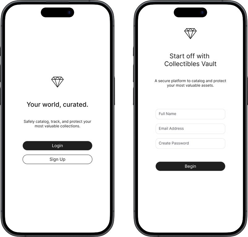
Collector downloads app → sees splash screen.
Creates account with minimal details.
Verifies identity via email → sets up Face ID.
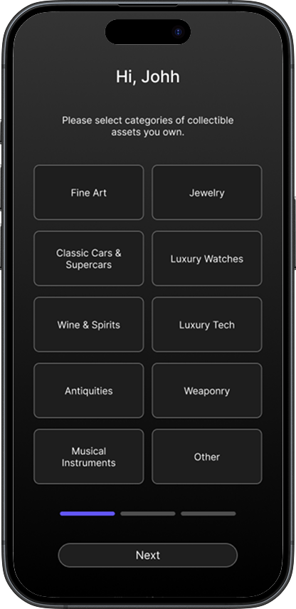
Selects categories (Art, Watches, Cars, NFTs).
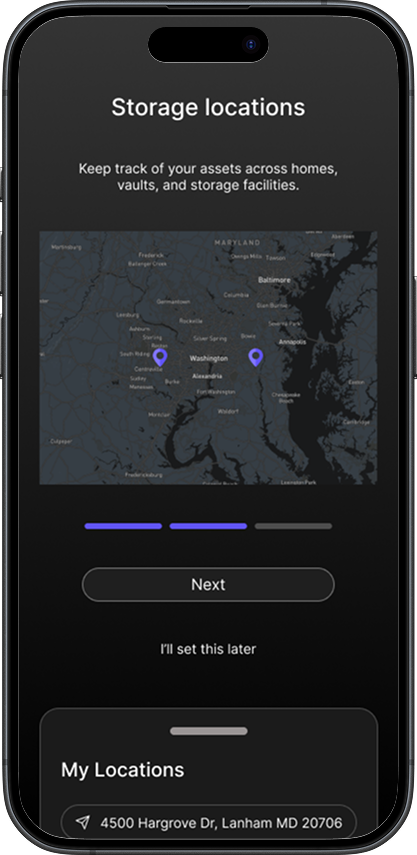
Adds or skips storage locations.
Success screen → vault ready → summary dashboard displayed.
Happy Path 1:
Assistant Cataloging
Assistant logs in with delegated access.
Adds artwork + provenance docs.
Assigns storage location + insurance policy.
Collector later opens app → sees asset listed in read-only dashboard.
Edge Case 1:
Collector refuses to share personal data
Risk: Drop-off at onboarding.
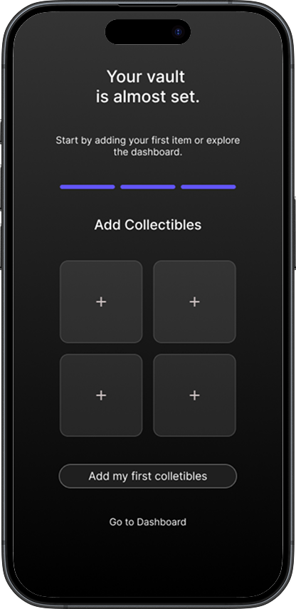
Solution: “Skip for now” options and reassurance microcopy (“All data stays encrypted and under your control.”).
Edge Case 2:
Assistant enters incomplete data
Risk: Dashboard feels inaccurate.
Solution: Progressive disclosure (placeholder tags: “Pending valuation,” “Storage not assigned”).
Edge Case 3:
Multiple advisors with conflicting edits
Risk: Overwrites / confusion.
Solution: Role-based permissions + activity log.
User Journey Maps
Journey Map 1: Collector (Owner Oversight)
| Stage | Action | Thoughts/Feelings | Opportunities |
|---|---|---|---|
| Awareness | Learns app via advisor recommendation | “Will this protect my data?” | Highlight privacy/security from start. |
| Onboarding | Minimal sign-up, Face ID setup | “This feels simple and discreet.” | Luxury microcopy, optional fields. |
| Setup | Selects categories + locations | “Good, this feels personalized.” | Offer “Skip for later” option. |
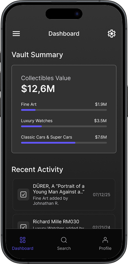
| Daily Use | Opens dashboard to check summary | “I know what I own and where.” | Provide clean visuals, alerts, valuations. |
| Long-term Use | Shares secure reports with heirs/advisors | “I feel in control of my assets.” | Secure sharing & role-based permissions. |
User Journey Maps
Journey Map 2: Assistant (Delegated Manager)
| Stage | Action | Thoughts/Feelings | Opportunities |
|---|---|---|---|
| Awareness | Asked by collector to use the app | “I hope this isn’t more work.” | Streamline data entry flows. |
| Onboarding | Logs in with delegated account | “Okay, I can do this for them.” | Clear roles (assistant vs. owner). |
| Setup | Uploads assets + docs | “This is faster than spreadsheets.” | Bulk upload features, auto-detect metadata. |
| Daily Use | Updates insurance or valuations | “Everything’s tracked in one place.” | Easy edit & sync features. |
| Long-term Use | Generates reports for owner/advisor | “This saves me time and keeps them happy.” | One-tap reporting/export tools. |
Ideation and Design Process
Ideation sessions involved sketching with the team to brainstorm features like asset categorization and location tracking. We used design thinking workshops to iterate from low-fidelity wireframes (focusing on information architecture) to high-fidelity prototypes in Figma.
Key Iterations:
Wireframes: Started with grayscale sketches for onboarding, emphasizing minimal fields to boost completion rates.
Prototypes: Built interactive flows for dashboard and permissions. Early feedback revealed confusion in storage assignment, leading to progressive disclosure (e.g., placeholders for pending data).
Collaboration: Weekly syncs with devs ensured feasibility; e.g., integrated Face ID early to validate security.
Design decisions prioritized accessibility (e.g., high-contrast modes) and scalability (modular components for future categories like real estate).
Visual Design & UI
The UI evokes trust through timeless aesthetics inspired by vaults and luxury materials: Neutral grayscale for clarity (steel-like strength), accented with regal violet for exclusivity. Typography uses serif fonts for editorial sophistication.


The logo was crafted to mirror the collectibles world itself — combining architecture, automotive design, horology, and materials engineering into a single visual identity that communicates trust, exclusivity, and permanence.

The Vault palette combines timeless neutrals with regal violet accents to balance discretion, trust, and luxury. The grayscale range reflects strength and clarity, evoking the permanence of steel and the calm precision of a vault, while the purple and violet tones signal exclusivity, prestige, and refinement — historically associated with royalty. Used sparingly as highlights, these accents elevate key interactions without overwhelming the interface, ensuring the overall design feels both secure and sophisticated, perfectly aligned with the world of rare and valuable collections.
Microcopy Examples
Onboarding & Security
“Exclusivity begins with security.”
“Your privacy, safeguarded.”
“Only you hold the key.”
“Face ID ensures instant, private access.”
Category & Collection Setup
“Choose the treasures you wish to catalog.”
“Every collection is unique — tailor your vault to yours.”
“You can refine or expand categories at any time.”
“From art to automobiles, all your assets belong here.”
Storage & Location Setup
“Where are your pieces safeguarded?”
“Track assets across homes, vaults, and exhibitions.”
“Location unassigned — update when ready.”
“Your vault adapts as your collection moves.”
Dashboard / Read-Only States
“Pending valuation — update in progress.”
“Storage not assigned — collector verification required.”
“Provenance uploaded — awaiting review.”
“This item is visible, details remain in progress.”
Wireframing
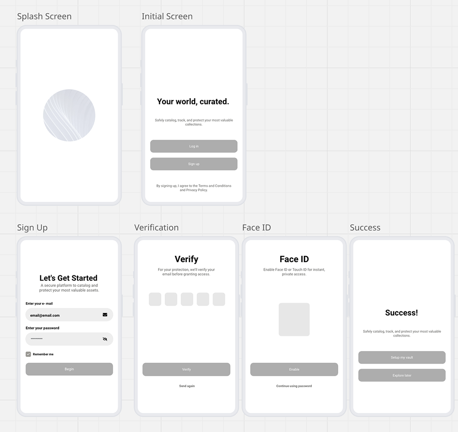

Design Summary
With strategy and wireframes in place, the next step was to bring the experience to life through high-fidelity design and iterative testing. This stage focused on translating concepts into tangible prototypes, validating flows with users, and refining the product to align with collectors’ expectations of security, elegance, and ease of use.

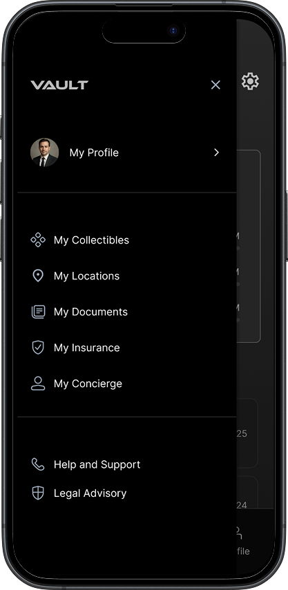
Prototypes
Onboarding Flow

Client Dashboard

Testing and Validation
We conducted usability testing with 5 participants (mirroring personas) via moderated sessions on prototypes. Metrics: Task success rate (95% for onboarding), time on task (reduced by 40% post-iteration), and SUS score (82/100).
Iterations Based on Feedback:
Added activity logs to resolve edit conflicts.
Refined permissions UI for clearer delegation.
Beta launched to 10 collectors; 80% reported improved confidence in asset management.
Outcomes and Impact
The MVP launched with core features: Biometric access, asset cataloging, location tracking, valuations, and permissions. Partnerships with insurers enabled seamless integrations.
Post-launch: 70% beta retention; users saved ~5 hours/week on manual tracking.
Business impact: Positioned for subscription model with concierge add-ons, targeting 20% market share in UHNW tools.
Next Steps
Beta Testing → private release with select collectors for feedback.
Partnerships → connect with insurers, galleries, and storage providers.
Go-to-Market → launch premium subscription model with concierge add-ons.